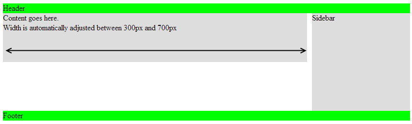
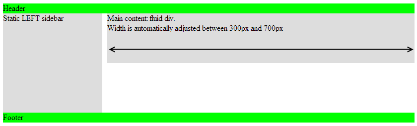
This is an example of webpage layout in HTML and CSS that you can use to create your own responsive web design.
This design allows website pages size to be automatically adapted according to the screen size of the visitor.
In this example, we will have:
- a menu sidebar, located on the right and with a fixed size
- a fluid content area that can be increased or reduced depending on the size of the screen of the visitor