This is an example of webpage layout in HTML and CSS that you can use to create your own responsive web design.
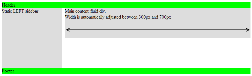
This design allows website pages size to be automatically adapted according to the screen size of the visitor.
In this example, we will have:
- a menu sidebar, located on the left and with a fixed size
- a fluid content area that can be increased or reduced depending on the size of the screen of the visitor
HTML & CSS code
In my example below, the sidebar size is 200px.
And the content area must have a minimum of 500px and a maximum of 1000px (if a visitor has a 32-inch screen, I prefer to limit the content size and not take the full with of the screen).
You can test the code directly from http://jsfiddle.net/geek17/56erp1my/
<!DOCTYPE html PUBLIC "-//W3C//DTD XHTML 1.0 Transitional//EN" "http://www.w3.org/TR/xhtml1/DTD/xhtml1-transitional.dtd">
 <html xmlns="http://www.w3.org/1999/xhtml">
 <head>
	<title>Fluid</title>
	<style type="text/css" media="screen">
	#wrap {margin: 0px; padding: 10px; max-width: 1000px; min-width: 500px; margin: auto;}

	#header {background: #0f0;}

	#sidebar{ width: 200px; float: left; height: 200px ;background: #ddd;}
	#content  {margin-left: 210px; left auto; min-height:100px; background:#ddd;}

	#footer {clear:both; background: #0f0;}
	</style>
</head>
<body>
	<div id="wrap">
		<div id="header">Header</div>
		<div id="sidebar">Static LEFT sidebar</div>
		<div id="content">Main content: fluid div<br/>Width is automatically adjusted between 300px and 700px</div>
		<div id="footer">Footer</div>
	</div>
</body>
</html>
Explanations
#wrap container allows to center the content inside the browser window (margin: auto).
This is in this container that we define the minimum and maximum width of our content (min-width: 500px and max-width: 1000px).
Note that width includes the sidebar + the content area.
#sidebar container is quite simple: a width of 200px (width: 200px) and left floating (float: left).
Then, the main container #content is positioned next to our sidebar.
Sidebar has 200px width and I want to add a margin of 10px between the sidebar and the content area. So I set margin-left: 210px; (do not forget the CSS rule left auto)
In #footer CSS code, you can see clear: both;
It allows to position the #footer block below the sidebar (regardless of the height of #content or #sidebar blocks).
Ajouter un commentaire